1
2
3
4
5
6
7
8
9
10
11
12
13
14
15
16
17
18
19
20
21
22
23
24
25
26
27
28
29
30
31
32
33
34
35
36
37
38
39
40
41
42
43
44
45
46
47
48
49
50
51
52
53
54
55
56
57
58
59
60
61
62
63
64
65
66
67
68
69
70
71
72
73
74
75
76
77
78
79
80
81
82
83
84
85
86
87
88
89
90
91
92
93
94
95
96
97
98
99
100
101
102
103
104
105
106
107
108
| <!DOCTYPE html>
<html lang="fr">
<head>
<meta charset="UTF-8">
<meta name="viewport" content="width=device-width, initial-scale=1.0">
<title>[CSS] Arrière plan en forme de flèche</title>
<meta name="Author" content="NoSmoking">
<meta name="DVP-discussion" content="d2131935">
<meta name="description" content="[CSS] Réalisation d'un arrière plan en forme de flèche sans élément HTML ajouté">
<style>
html, body {margin: 0;padding: 0;font: 1em/1.5 Verdana,sans-serif;}
h1, h2, h3 {margin: .25em 0;color: #069;}
time {float: right;margin: .5em;font-size: 0.9em;color: #888;}
main {display: block;margin: auto;max-width: 60em;}
section {position: relative;margin: 0 1em 1em;}
section > :not(h2) {margin-left: 1em;}
</style>
<style>
h1 {
color: inherit;
}
.mw15 {
min-width: 15em;
}
/*=-- arrow --=*/
.rect-clip-path,
.rect-pseudo {
display: flex;
position: relative;
align-items: center;
justify-content: center;
width: max-content;
height: 5em;
margin-bottom: 1em;
padding: 0 1em;
color: #0F0;
background-color: #060;
}
/*=-- with pseudo-element --=*/
.rect-pseudo-arrow-left:before,
.rect-pseudo-arrow-right:after {
content: "";
z-index: -1;
position: absolute;
top: 50%;
height: 71%;
background-color: inherit;
aspect-ratio: 1 / 1;
}
.rect-pseudo-arrow-right:after {
right: 0;
transform: rotate(45deg) translate(0, -71%);
}
.rect-pseudo-arrow-left:before {
left: 0;
transform: rotate(315deg) translate(0%, -71%);
}
/*=-- with clip-path --=*/
.rect-clip-path {
--pad: 2.5em;
}
.rect-clip-path-arrow-left {
padding-left: var(--pad);
clip-path: polygon(0 50%,var(--pad) 0,100% 0,100% 100%,var(--pad) 100%);
}
.rect-clip-path-arrow-right {
--posRight: calc(100% - var(--pad));
padding-right: var(--pad);
clip-path: polygon(0 0,var(--posRight) 0,100% 50%,var(--posRight) 100%,0 100%);
}
.rect-clip-path-arrow-left-right {
--posRight: calc(100% - var(--pad));
padding-right: var(--pad);
padding-left: var(--pad);
clip-path: polygon(0 50%,var(--pad) 0,var(--posRight) 0,100% 50%,var(--posRight) 100%,var(--pad) 100%);
}
</style>
</head>
<body>
<main>
<section>
<h2>Arrow with pseudo-élément</h2>
<div class="rect-pseudo rect-pseudo-arrow-left mw15">
<h1>Arrow left</h1>
</div>
<div class="rect-pseudo rect-pseudo-arrow-right mw15">
<h1>Arrow right</h1>
</div>
<div class="rect-pseudo rect-pseudo-arrow-left rect-pseudo-arrow-right mw15">
<h1>Arrow left & right</h1>
</div>
</section>
<section>
<h2>Arrow with clip-path</h2>
<div class="rect-clip-path rect-clip-path-arrow-left mw15">
<h1>Arrow left</h1>
</div>
<div class="rect-clip-path rect-clip-path-arrow-right mw15">
<h1>Arrow right</h1>
</div>
<div class="rect-clip-path rect-clip-path-arrow-left-right mw15">
<h1>Arrow left & right</h1>
</div>
</section>
</main>
</body>
</html> |


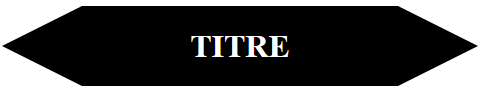
 Dessiner des flèches avec CSS


 Répondre avec citation


Partager