1
2
3
4
5
6
7
8
9
10
11
12
13
14
15
16
17
18
19
20
21
22
23
24
25
26
27
28
29
30
31
32
33
34
35
36
37
38
39
40
41
42
43
44
45
46
47
48
49
50
51
52
53
54
55
56
57
58
59
60
61
62
63
64
65
66
67
68
69
70
71
72
73
74
75
76
77
78
79
80
81
82
83
84
85
86
87
88
89
90
91
92
93
94
95
96
97
98
99
100
101
102
103
104
105
106
107
108
109
110
111
112
113
114
115
116
117
118
119
120
121
122
123
124
125
126
127
128
129
130
131
132
133
134
135
136
137
138
139
140
141
142
143
144
145
146
147
148
149
150
151
152
153
154
155
156
157
158
159
160
161
162
163
164
165
|
<Style TargetType="{x:Type Menu}">
<Setter Property="Foreground" Value="White"/>
<Setter Property="FontSize" Value="14"/>
<Setter Property="FontFamily" Value="Arial"/>
<Setter Property="FontWeight" Value="Bold"/>
<Setter Property="Background">
<Setter.Value>
<LinearGradientBrush EndPoint="0.5,1" StartPoint="0.5,0">
<GradientStop Color="#FF46738A" Offset="1"/>
<GradientStop Color="#FF46738A"/>
</LinearGradientBrush>
</Setter.Value>
</Setter>
</Style>
<Style TargetType="{x:Type MenuItem}">
<Setter Property="Foreground" Value="{Binding Path=Foreground, RelativeSource={RelativeSource AncestorType={x:Type Menu}}}"/>
<Setter Property="Background">
<Setter.Value>
<LinearGradientBrush EndPoint="0.5,1" StartPoint="0.5,0">
<GradientStop Color="#FF46738A" Offset="1"/>
<GradientStop Color="#FF46738A"/>
</LinearGradientBrush>
</Setter.Value>
</Setter>
<Setter Property="Height" Value="28"/>
<Setter Property="VerticalAlignment" Value="Center"/>
<Setter Property="VerticalContentAlignment" Value="Center"/>
<Setter Property="Template">
<Setter.Value>
<ControlTemplate TargetType="{x:Type MenuItem}">
<Border x:Name="Border"
Background="{TemplateBinding Background}"
BorderBrush="{x:Null}"
BorderThickness="0">
<Grid >
<Grid.ColumnDefinitions>
<ColumnDefinition x:Name="Col0" MinWidth="20" Width="Auto" SharedSizeGroup="MenuItemIconColumnGroup"/>
<ColumnDefinition Width="Auto" SharedSizeGroup="MenuTextColumnGroup"/>
<ColumnDefinition Width="Auto" SharedSizeGroup="MenuItemIGTColumnGroup"/>
<ColumnDefinition x:Name="Col3" Width="16"/>
</Grid.ColumnDefinitions>
<!-- ContentPresenter to show an Icon if needed -->
<ContentPresenter Grid.Column="0" Margin="4,0,6,0" x:Name="Icon" VerticalAlignment="Center" ContentSource="Icon"/>
<!-- Glyph is a checkmark if needed for a checkable menu -->
<Grid Grid.Column="0" Visibility="Hidden" Margin="6,0,6,0" x:Name="GlyphPanel" VerticalAlignment="Center" HorizontalAlignment="Center">
<Path x:Name="GlyphPanelpath" VerticalAlignment="Stretch" Fill="{TemplateBinding Background}" Data="M0,2 L0,4.8 L2.5,7.4 L7.1,2.8 L7.1,0 L2.5,4.6 z" FlowDirection="LeftToRight"/>
</Grid>
<!-- Content for the menu text etc -->
<ContentPresenter Grid.Column="1"
Margin="3,3,3,3"
x:Name="HeaderHost"
RecognizesAccessKey="True"
ContentSource="Header"/>
<!-- Content for the menu IGT -->
<ContentPresenter Grid.Column="2" Margin="3,0,3,0" x:Name="IGTHost" ContentSource="InputGestureText" VerticalAlignment="Center"/>
<!-- Arrow drawn path which points to the next level of the menu -->
<Grid Grid.Column="3" Margin="4,0,6,0" x:Name="ArrowPanel" VerticalAlignment="Center">
<Path x:Name="ArrowPanelPath" HorizontalAlignment="Right" VerticalAlignment="Center" Fill="{TemplateBinding Foreground}" Data="M0,0 L0,8 L4,4 z"/>
</Grid>
<!-- The Popup is the body of the menu which expands down or across depending on the level of the item -->
<Popup IsOpen="{Binding Path=IsSubmenuOpen, RelativeSource={RelativeSource TemplatedParent}}" Placement="Right" x:Name="SubMenuPopup" Focusable="false" PopupAnimation="{DynamicResource {x:Static SystemParameters.MenuPopupAnimationKey}}">
<Border x:Name="SubMenuBorder" BorderBrush="{Binding Path=Foreground, RelativeSource={RelativeSource AncestorType={x:Type Menu}}}" BorderThickness="0" Padding="0">
<Grid x:Name="SubMenu" Grid.IsSharedSizeScope="True">
<!-- StackPanel holds children of the menu. This is set by IsItemsHost=True -->
<StackPanel IsItemsHost="True" KeyboardNavigation.DirectionalNavigation="Cycle"/>
</Grid>
</Border>
</Popup>
</Grid>
</Border>
<!-- These triggers re-configure the four arrangements of MenuItem to show different levels of menu via Role -->
<ControlTemplate.Triggers>
<!-- Role = TopLevelHeader : this is the root menu item in a menu; the Popup expands down -->
<Trigger Property="Role" Value="TopLevelHeader">
<Setter Property="Padding" Value="2,1,6,1"/>
<Setter Property="Placement" Value="Bottom" TargetName="SubMenuPopup"/>
<Setter Property="MinWidth" Value="0" TargetName="Col0"/>
<Setter Property="Width" Value="Auto" TargetName="Col3"/>
<Setter Property="Visibility" Value="Collapsed" TargetName="Icon"/>
<Setter Property="Visibility" Value="Collapsed" TargetName="GlyphPanel"/>
<Setter Property="Visibility" Value="Collapsed" TargetName="IGTHost"/>
<Setter Property="Visibility" Value="Collapsed" TargetName="ArrowPanel"/>
</Trigger>
<!-- Role = TopLevelItem : this is a child menu item from the top level without any child items-->
<Trigger Property="Role" Value="TopLevelItem">
<Setter Property="Padding" Value="0,1,0,1"/>
<Setter Property="Visibility" Value="Collapsed" TargetName="ArrowPanel"/>
</Trigger>
<!-- Role = SubMenuHeader : this is a child menu item which does not have children -->
<Trigger Property="Role" Value="SubmenuHeader">
<Setter Property="DockPanel.Dock" Value="Top"/>
<Setter Property="Padding" Value="0,2,0,2"/>
</Trigger>
<!-- Role = SubMenuItem : this is a child menu item which has children-->
<Trigger Property="Role" Value="SubmenuItem">
<Setter Property="DockPanel.Dock" Value="Top"/>
<Setter Property="Padding" Value="0,1,0,1"/>
<Setter Property="Visibility" Value="Collapsed" TargetName="ArrowPanel"/>
</Trigger>
<Trigger Property="IsSuspendingPopupAnimation" Value="true">
<Setter Property="PopupAnimation" Value="None" TargetName="SubMenuPopup"/>
</Trigger>
<!-- If no Icon is present the we collapse the Icon Content -->
<Trigger Property="Icon" Value="{x:Null}">
<Setter Property="Visibility" Value="Collapsed" TargetName="Icon"/>
</Trigger>
<!-- The GlyphPanel contains the CheckMark -->
<Trigger Property="IsChecked" Value="true">
<Setter Property="Visibility" Value="Visible" TargetName="GlyphPanel"/>
<Setter Property="Visibility" Value="Collapsed" TargetName="Icon"/>
</Trigger>
<!-- Using the system colors for the Menu Highlight and IsEnabled-->
<Trigger Property="IsHighlighted" Value="true">
<Setter Property="Background" TargetName="Border">
<Setter.Value>
<LinearGradientBrush EndPoint="0.5,1" StartPoint="0.5,0">
<GradientStop Color="#FF6E97B7" Offset="1"/>
<GradientStop Color="WhiteSmoke"/>
</LinearGradientBrush>
</Setter.Value>
</Setter>
</Trigger>
<Trigger Property="IsEnabled" Value="false">
<Setter Property="Foreground" Value="LightGray"/>
</Trigger>
</ControlTemplate.Triggers>
</ControlTemplate>
</Setter.Value>
</Setter>
</Style>
<Style TargetType="{x:Type Separator}">
<Setter Property="Margin" Value="0,2,0,2"/>
<Setter Property="Focusable" Value="false"/>
<Setter Property="Template">
<Setter.Value>
<ControlTemplate TargetType="{x:Type Separator}">
<Border BorderBrush="{TemplateBinding BorderBrush}"
BorderThickness="{TemplateBinding BorderThickness}"
Background="{TemplateBinding Background}"
Height="1"
SnapsToDevicePixels="true"/>
</ControlTemplate>
</Setter.Value>
</Setter>
</Style> |


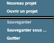
 Réaliser un style pour une barre de menu
).
 Répondre avec citation


 Pas de questions techniques par MP ! Le forum est là pour ça...
 Tutoriels :
  Envoyé par Masmeta

Partager