


Bonjour à tous,
Je souhaiterais construire un histogramme horizontal à partir d'un fichier .txt.
Code : Sélectionner tout - Visualiser dans une fenêtre à part
2
3
4
5
6
7
8
9
Comme el fichier contient une colonne de Strings et une colonne de Integer, je pense qu'un dataframe est mieux indiqué qu'un array.
Je souhaiterais mettre mes contenus de colonne dans des series pour les 'plot'.
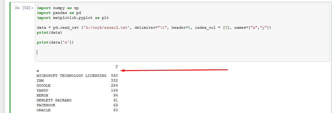
Cependant pour une raison que j'ignore, je n'arrive pas à importer correctement ma donnée et son header.
Il ne place pas les headers "x" et "y" au même niveau et de fait je ne peux pas sélectionner mes colonnes.
Pouvez-vous m'éclairer sur ce problème simple ?
Note : j'ai revérifié mon fichier source, et essayé en txt et csv, je ne vois aucun espace "nuisble"..
Merci par avance,
Cdt,
G.
 Répondre avec citation
Partager