


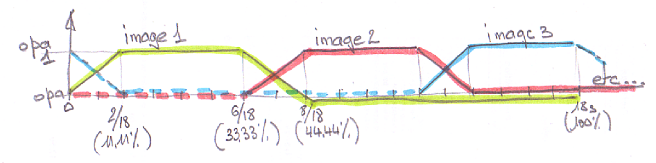
 Animation de transition
Bonjour,
Pouvez vous m'aider à comprendre le problème de ma page d'accueil.
La transitions sur les images ne marche pas bien et je ne comprend pas pourquoi.
Je place la page d'accueil pour que vous puissiez voir :
residencevacances-istres
Et le code CSS en question :
Je suis parti d'un script existant pour allé plus vite, enfin je pensais.
Code : Sélectionner tout - Visualiser dans une fenêtre à part
2
3
4
5
6
7
8
9
10
11
12
13
14
15
16
17
18
19
20
21
22
23
24
25
26
27
28
29
30
31
32
33
34
35
36
37
38
39
40
41
42
43
44
45
46
47
48
49
50
51
52
53
54
55
56
57
58
59
60
61
62
63
64
65
66
67
68
69
70
71
72
73
74
75
76
77
78
79
80
81
82
83
84
85
86
87
88
89
90
91
Merci pour l'aide.
A+
 Répondre avec citation


")
Partager