1
2
3
4
5
6
7
8
9
10
11
12
|
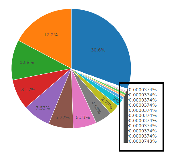
       plot_ly(aggregate( Envoi ~  nom_campagne  , subset(crm,  crm$brand_id == 5
                                                          & crm$Year == 2019
                                                          & crm$Canal == 'Email') , length)
               , labels = ~nom_campagne, values = ~Envoi, type = 'pie',
               marker = list(colors = colors,
                             line = list(color = '#FFFFFF', width = 1)),
               #The 'pull' attribute can also be used to create space between the sectors
               showlegend = FALSE) %>%
         layout(title = '',
                xaxis = list(showgrid = FALSE, zeroline = FALSE, showticklabels = FALSE),
yaxis = list(showgrid = FALSE, zeroline = FALSE, showticklabels = FALSE)) |


 Répondre avec citation

Partager